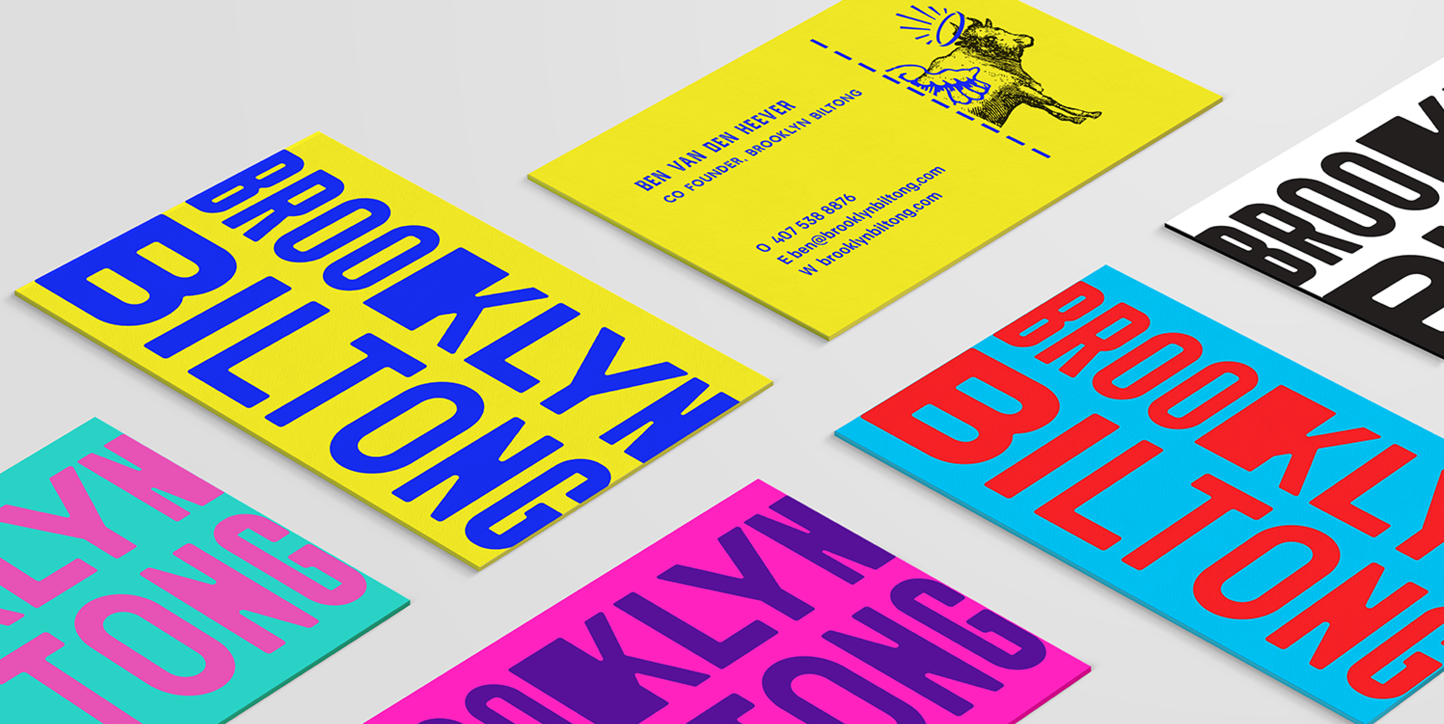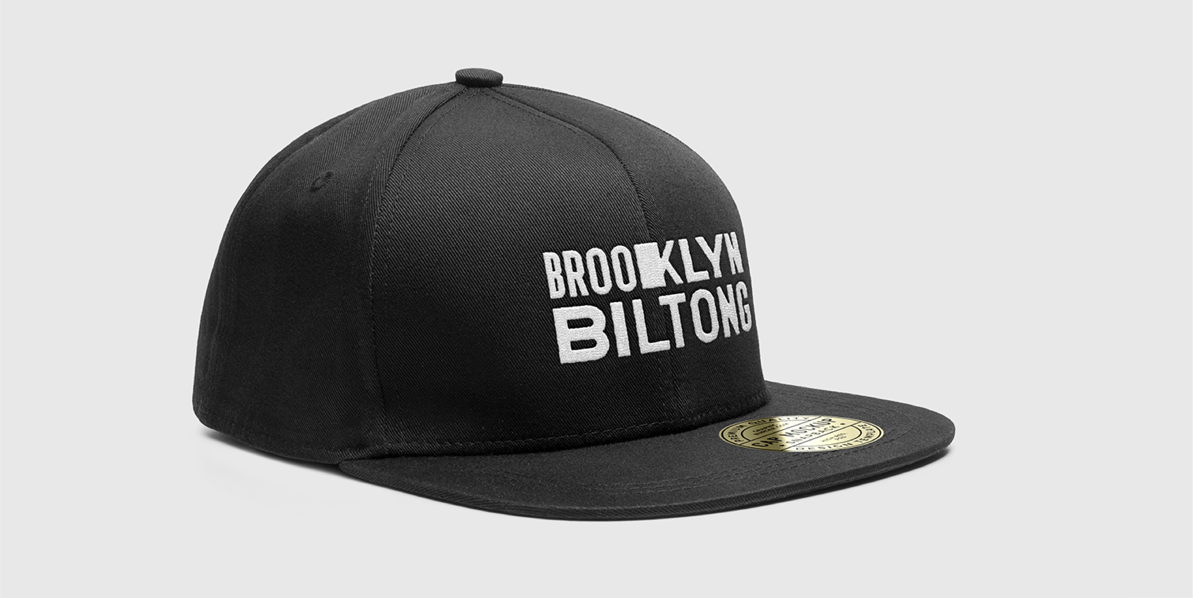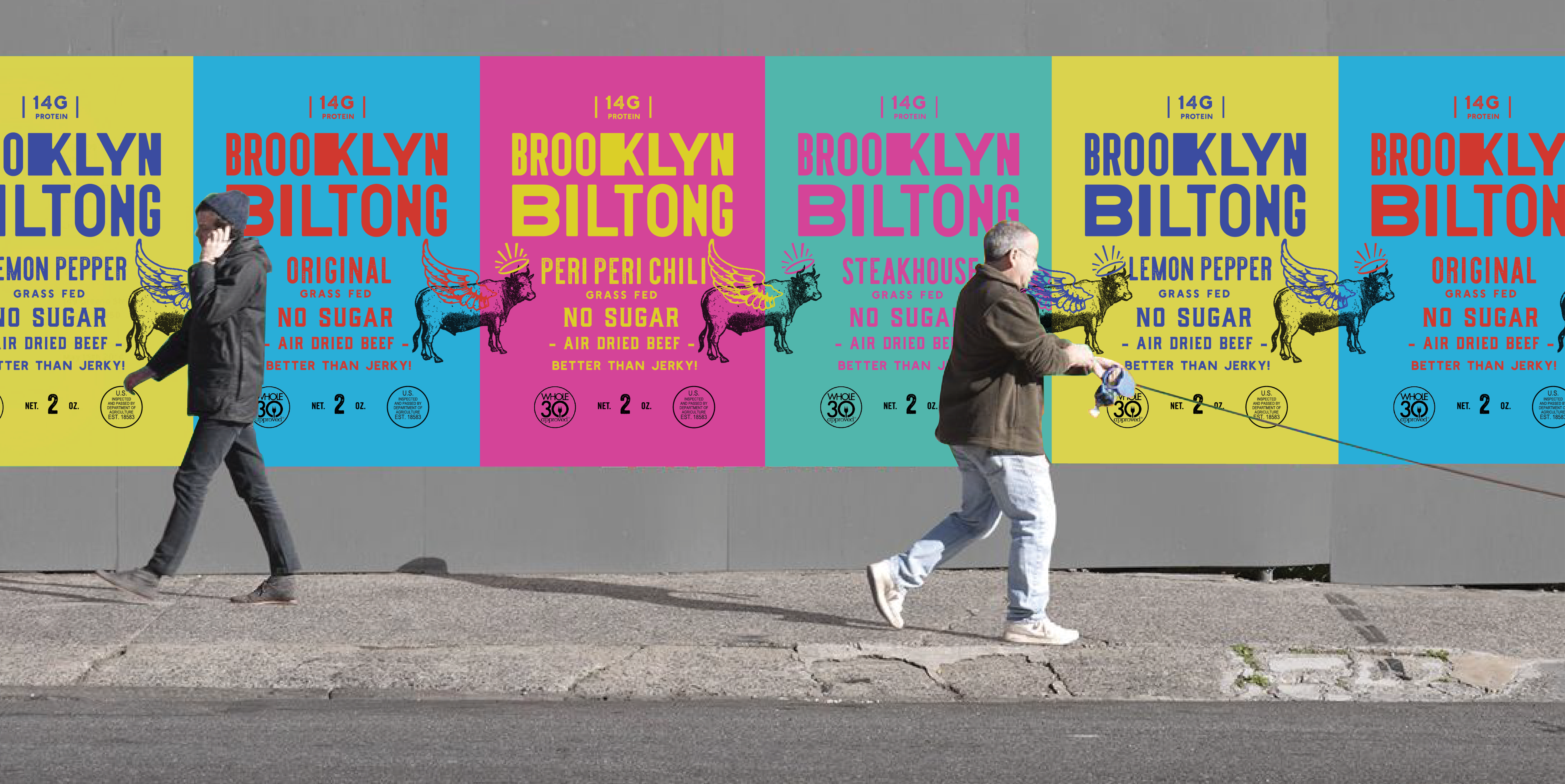
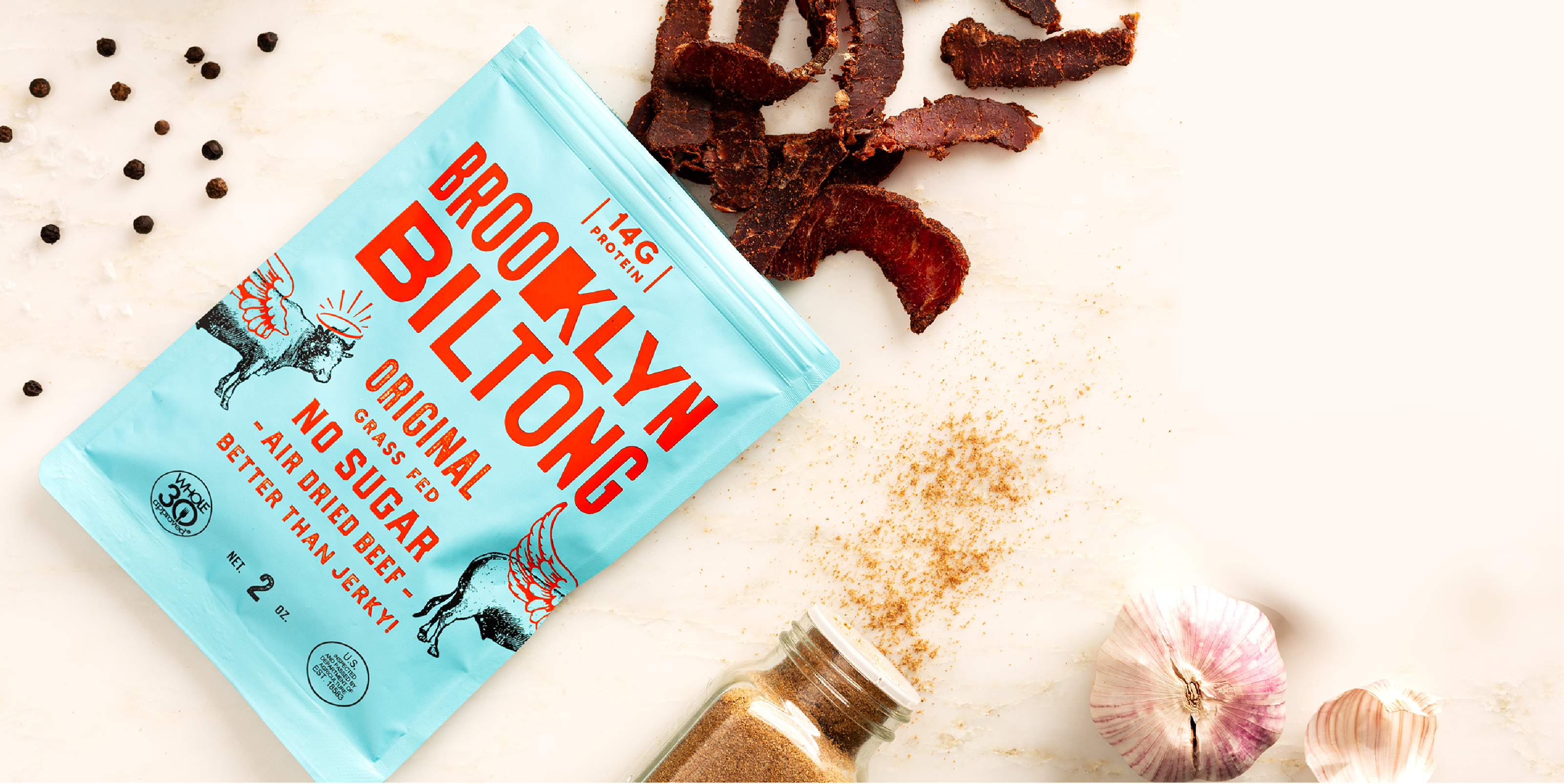
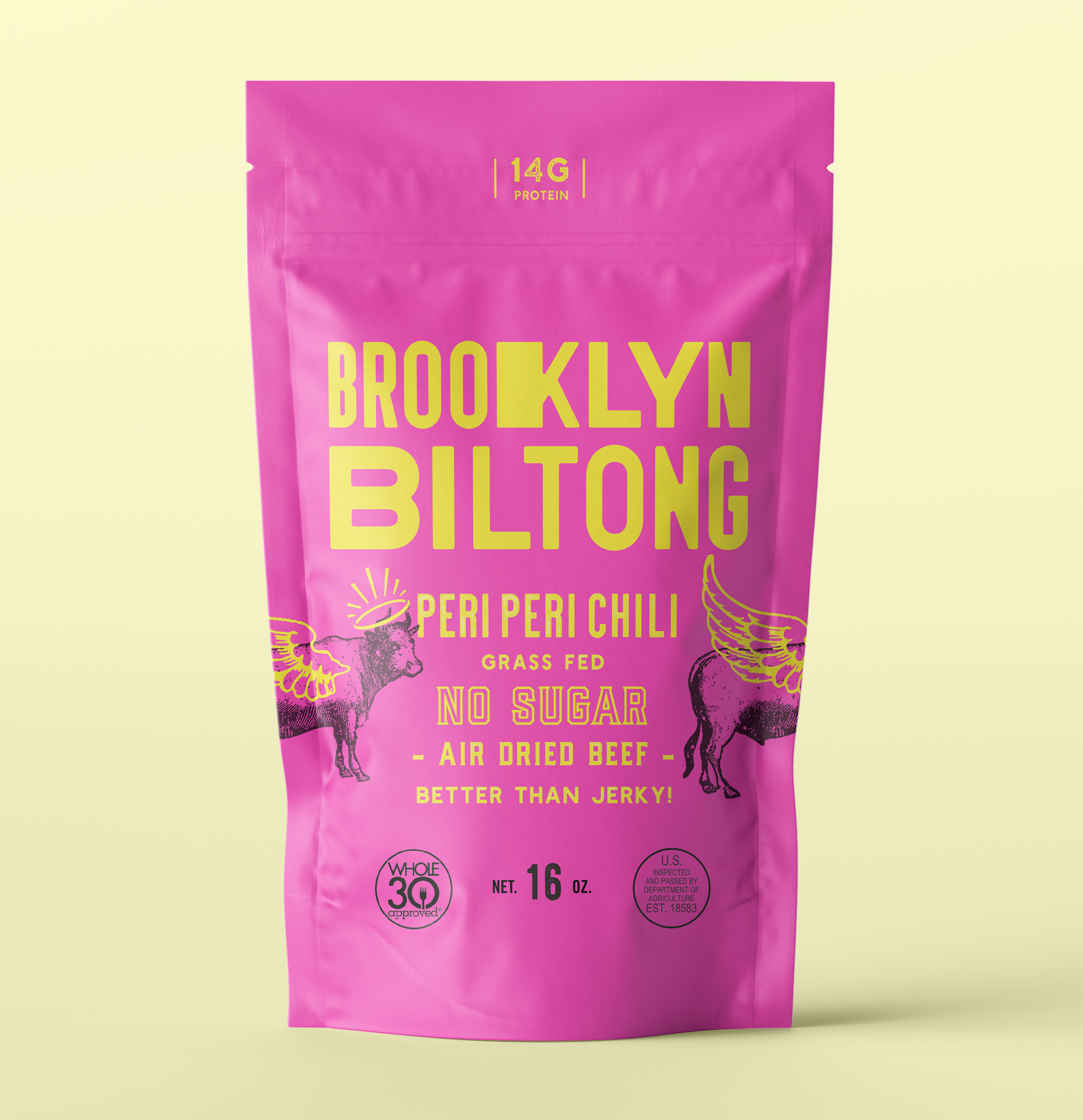
An identity inspired by the boroughs. How do you introduce biltong —South African snack staple— to a U.S. audience for the first time? Inspired by the streets of Brooklyn, the packaging design drew upon the classic wheatpaste posters and irreverent illustrations found plastered across the city. The resulting identity made Brooklyn Biltong feel familiar, yet playful enough to spark curiosity.
Collaborators
Founders
Ben + Emily Van Den Heever
Photography
BK Biltong Team
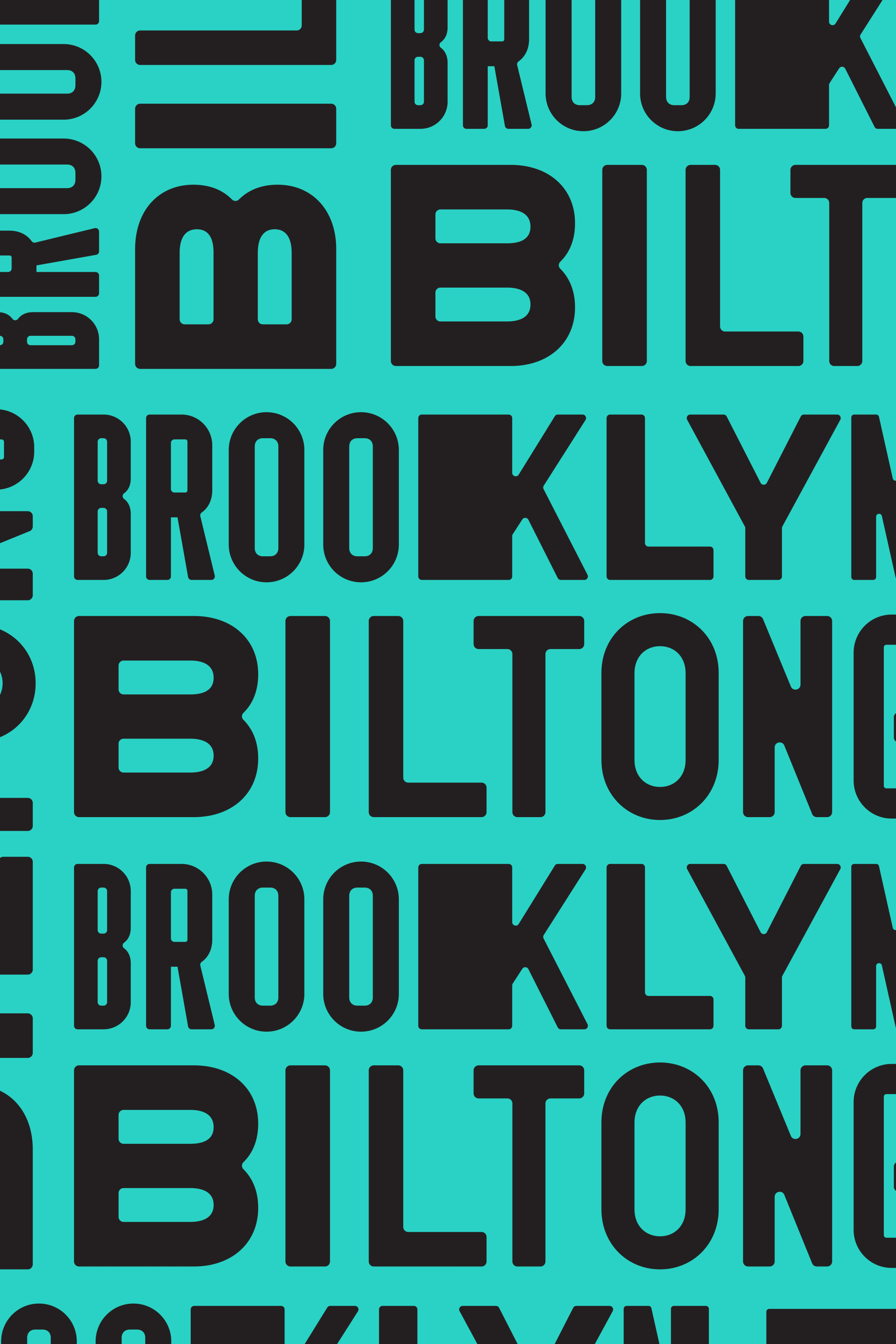
Packaging tissue pattern